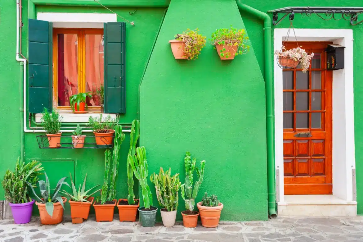
In the world of architecture and interior design, color isn’t just about aesthetics—it’s about shaping our experiences, perceptions, and even our emotions. Like a powerful yet silent language, hues have the ability to revamp spaces, redefine borders, and speak volumes without words.
For those who craft the built environment, whether for inspiration or as creators themselves, understanding the profound impact of color is a foundational skill. It’s time to explore the multilayered canvas of color theory and its applications from the grand cityscapes to the smallest, most intimate corners of our homes.
Foundations of Color Theory in Architecture
The Historic Foundations
Color in architecture is no modern phenomenon—the foundations of how visual spectrums shape our built environments are as old as architecture itself. From the warm earth tones of adobe to the vibrant facades of Classical Europe, colors have been used to lend identity and meaning to structures across time and culture.
Immersion in Enlightened Thought
During the Enlightenment, the study of color entered a new era as theories of light and perception were dissected by giants like Isaac Newton. The result was an eruption of understanding, propelling architects and artists to harness color with newfound rigor and purpose.
Chromatic Exteriors Reshaping Our Cities
The Palette of a Metropolis
When observing the skylines and streetscapes of our most populous cities, one might not always consider the role of color. Yet, it’s in the subtle gradients and bold contrasts that we find an essential element in the city’s narrative and cultural expression.
Sustainable Hues
With a global push for sustainability, the conversation around color in exteriors includes practical applications. Reflective and green roof solutions play on color to manage urban heat, reduce energy consumption, and promote biodiversity.
Interior Design: The Personal Color Story
Emotional Hues of Home
Our homes are the most intimate expressions of architectural color theory. Each room becomes a page in a book, woven with chromatic threads that influence our psychology, from the energizing power of red to the soothing calm of blue.
The Art of Wayfinding
Color’s role in wayfinding cannot be overstated. In places of commerce, wellness, or learning, strategic color choices guide footsteps, divide spaces, and convey brand identities.
When Colors Collide: Balancing Bold and Subtle
High-Impact Spaces
Architectural color theory teaches us that a well-placed bold color can be the showstopper, the signature on the canvas of a room or a building. But to wield these colors effectively, architects must understand the surrounding hues and architectural forms.
Subtlety in Design
While bold colors make a statement, the subtler palettes hold the design together. These subdued hues allow architectural details to shine, integrating them into the holistic experience of a space.
The Future Palette: Innovations and Applications
Digital Tools Converging with Tradition
The digital realm offers architects and designers a powerful set of tools to experiment with color in ways that weren’t possible before. However, it’s the delicate dance between digital and traditional methods that will yield the most vibrant and nuanced designs.
Pigments of the Imagination
Advancements in materials science are expanding the palette available to the contemporary architect. From self-tinting windows to eco-friendly biodegradable paints, the future looks brighter and more sustainable.
The Palette of Architecture’s Human Connection
The Societal Mirror
Architecture is, at its core, an expression of society. The colors chosen for buildings and spaces reflect the culture, values, and sentiments of the people they serve and the time in which they were built.
A Global Dialogue in Hues
In an increasingly interconnected world, architectural colors become part of a global dialogue, blending and transmitting the palette of human experience across borders and oceans.
Conclusion: Painting a Beautiful and Meaningful Future
In this exploration of color theory’s application in architecture, we’ve scratched the surface of a complex and dynamic world. The hues we choose to paint our structures and spaces are more than ephemeral trends—they are the brushstrokes of legacies yet to be written, and the hues of the collective human narrative.
For those at the helm of design decisions, whether gazing out at the skyline they’ve shaped or resting in the sanctuaries they’ve adorned, the canvas is vast, and the potential profound. With knowledge of color’s power, respect for tradition, and a curious eye on the horizon, architects and interior designers can continue painting a future that delights, inspires, and connects us all.


